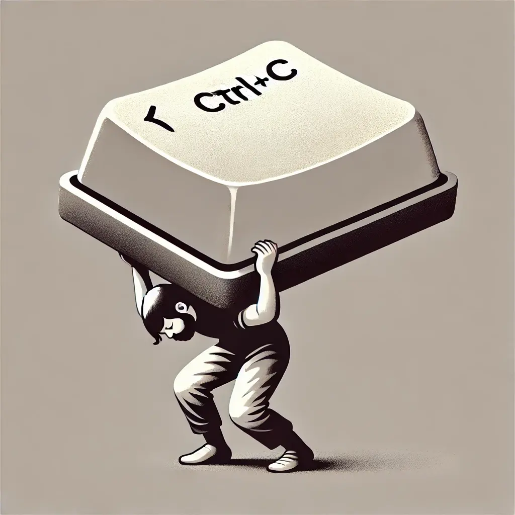
Skeuomorphism. It’s a bit of a mouthful, but it’s a concept that has played a significant role in how we interact with our computers and digital devices. The idea behind skeuomorphism is simple - make digital objects look and feel like their real-world counterparts to make them more intuitive for users. But how does this design approach impact your day-to-day productivity? And is it still relevant in today’s work environment?
The Origins of Skeuomorphism
In the early 1980s, personal computers like the Texas Instruments TI-99/4A or the Commodore 64 primarily relied on text-based input and command-line interfaces (CLIs). There were no windows, icons or menus. Interaction was purely through lines of text on a screen. While this worked well for tech enthusiasts, it wasn’t user-friendly for the average person.
But as with any product, widespread adoption requires making it more user-friendly and intuitive. This demand led to the development of graphical user interfaces (GUIs), which democratized technology by introducing windows, icons, and menus - elements that made computers accessible to a broader audience.
While GUIs facilitated the expansion of personal computing, their design was driven by the need to solve specific business and technical challenges, like enabling multiple programs to run simultaneously. Ultimately, this approach wasn’t just about enhancing usability - it was about creating a more marketable product that could appeal to a wider user base.
That’s why skeuomorphism emerged during this transition. To help users navigate the unfamiliar digital world, designers made digital objects look like their real-world counterparts - a notepad app looked like a real notepad, a calculator like a real one, a folder like the one you’d find in a good old filing cabinet. These familiar visuals eased the learning curve for new users.
But as we all become more comfortable with our digital environments, the need for these literal representations diminished. This led to the rise of “flat design” - a minimalist approach that prioritizes simplicity and functionality over ornamentation. Flat design, was in part, a response to the visual clutter that skeuomorphism created for us on our screens. The visual metaphors, while helpful initially, began to overload our interfaces with unnecessary details, making them harder to use.
The Missed Point of GUIs
The debate between skeuomorphism and flat design is interesting, but it misses a much more critical issue - GUIs have remained fundamentally unchanged for decades.
Whether your digital workspace is filled with realistic icons or minimalist designs doesn’t address the real challenge we face today.
Our digital tools and environments are outdated and don’t truly support modern work. The GUI was never designed to enhance human capacity. It was designed to drive adoption and manage processing constraints.
While iterations from CLIs to GUIs made computers more accessible, the core structure of the GUI has remained the same. We’re still dealing with siloed apps, scattered information, and constant context switching, forcing us to mentally hold everything together. It’s overwhelming.
The real issue isn’t whether a notepad app looks like paper or is represented by a simple icon. The problem is that the tools we use aren’t designed to help us focus on the work that needs to get done.
Despite all the visual changes and iterations, GUIs haven’t evolved in a way that genuinely enhances our ability to think deeply, work creatively, and collaborate seamlessly.
The Real Issue: Siloed Apps
The real problem lies in how the apps and tools we use today, no matter how beautifully designed or productivity-focused, often exist in silos. They don’t communicate with each other in meaningful ways, forcing us to constantly switch contexts, manage scattered information, and mentally hold everything together. This fragmented way of working isn’t just inefficient, it’s exhausting.
The clutter and overload we experience isn’t just visual - it’s mental.
Think about your typical workday.
How often do you find yourself bouncing between email, chat apps, project management tools, and dozens of open tabs trying to piece together the information you need to complete a task?
How much time and effort do you dedicate to managing the chaos of scattered information, just to get the actual work done? This study suggests that it’s about 60% of your time.
This way of working doesn’t just slow us down, it also increases our cognitive load, making it harder for us to focus and do meaningful work.
The Future of Work Requires Us to Move Beyond Surface Level Changes
So where does this leave us?
If the evolution of GUIs - from skeuomorphism to flat design - hasn’t solved the core problems, then what will? What’s the next step?
Well, it’s definitely not by making more aesthetic tweaks. The real answer lies in a fundamental rethinking of how digital environments are structured.
At Reframe, we’re not just focusing on how things look, but on how the entire system can better support human work. We’re moving beyond the surface-level aesthetics to build technology that truly aligns with the way we work as humans, helping you do your best work, not just more work.
Imagine a digital workspace that “understands” the context of your tasks, integrates your tools seamlessly, and reduces the cognitive load of managing multiple apps.
An Organized Work Environment (OWE) with contextual awareness, delivering the right tools and information at the right time, so you can focus on what truly matters.
The future of work isn’t about adding more features or tweaking designs. It’s about creating environments that help us work better, think deeper, and free us up to achieve our goals and reach our full potential.
This is the future we’re building.
Want to experience it for yourself? Sign up to get early access.


